


JavaScript
素のJavaScriptでモーダルウィンドウ(ポップアップ/ダイアログ/ライトボックス)
- 最終更新日:


jQueryも他のライブラリもなしで、素のJavaScriptだけでモーダルウィンドウを表示する方法をご紹介します。
jQueryの利用有無でLighthouseのパフォーマンス点数が10点ぐらい違うという報告も見ています。ホームページレベルでjQueryに頼りたくなるものと言えば、私はアコーディオンメニューぐらいかなと思っていますが、アコーディオンメニューもjQueryなしで実装する方法をご紹介していますので、そちらもよろしければご参照ください。
モーダルウィンドウとは
「モーダルウィンドウ」は、元の画面の上に表示され、表示されている間、元の画面が操作できない状態になるものを指します。
「ポップアップ」「ダイアログ」「ライトボックス」という言葉があります。
「ポップアップ」と呼ぶものは本記事でご紹介するものとは少し違い、元の画面も操作ができる状態のことを指すのが一般的です。
「ダイアログ」というのは、「ポップアップ」も、「モーダルウィンドウ」も、どちらにも当てはまるような言葉だと思います。
「モーダルウィンドウ」を簡単に作れる「ライトボックス」というライブラリがあり、それにより、「モーダルウィンドウ」のことを「ライトボックス」と呼ぶのが一般化していた時期もあったと思います。
デモ1「モーダルウィンドウ内がスクロールする」
次のボタンを押すとモーダルウィンドウが開きます。モーダルウィンドウ内がスクロールします。
デモ2「モーダルウィンドウでサムネイル表示」
次のサムネイルからどれか一つクリックするとモーダルウィンドウが表示されます。かつ「<」「>」のボタンが表示され、前後の画像にモーダル内で移動できます。


デモ1「モーダルウィンドウ内がスクロールする」のコード
HTML
<div class="modal-btn-wrapper">
   <button id="modal-btn" class="modal demo">モーダルウインドウを開く</button>
</div>
<div class="modal-overlay">
   <div class="modal-window">
      <button id="close" aria-label="閉じる"></button>
      <h2>モーダルウインドウ</h2>
      <p>省略</p>
   </div>
</div>
CSS
.modal-overlay{
   visibility: hidden;
   position: fixed;
   left: 0;
   top: 0;
   width: 100vw;
   height: 100vh;
   background-color: rgba(0,0,0,.7);
   z-index: 999;
  transition: .3s;
  opacity:0;
}
.modal-overlay.active{
   visibility: visible;
   transition: .3s;
   opacity: 1;
}
.modal-window{
   position: absolute;
   top: 50%;
   left: 50%;
   transform: translate(-50%,-50%);
   background-color: #fff;
   width: 80%;
   max-width: 900px;
   height: 500px;
   margin: 0;
   padding: 30px;
   overflow-y: auto;
}
#close-01 {
    position: absolute;
    width: 20px;
    height: 20px;
    top: 20px;
    right: 20px;
}
#close-01::before {
   content: '';
   position: absolute;
   top: 50%;
   left: 50%;
   width: 25px;
   height: 1px;
   background-color: #000;
   transform: translate(-50%, -50%) rotate(45deg);
}
#close-01::after {
   content: '';
   position: absolute;
   top: 50%;
   left: 50%;
   width: 25px;
   height: 1px;
   background-color: #000;
   transform: translate(-50%, -50%) rotate(-45deg);
}
.modal-opened {
    overflow-y: hidden; /*背景を固定*/
}

@media screen and (max-width: 900px) {
#prev, #next {
    width: 40px;
    height: 40px;
    top: 114%;
}
#prev{
left: 35%;
}
#next{
right: 35%;
}
}
JavaScript
const modal_btn = document.getElementById('modal-btn');
const modal_01 = document.querySelector('modal-overlay');
const closeBtn_01 = document.getElementById('close-01')

modal_btn.addEventListener('click', function() {
   modal_01.classList.add('active');
   document.querySelector('body').classList.add('modal-opened'); //body要素にクラスを与える
   closeBtn_01.addEventListener('click', function() {
      modal_01.classList.remove('active');
      document.querySelector('body').classList.remove('modal-opened');
   }, false);
   document.addEventListener('keydown', keydown_ivent);
   function keydown_ivent(e) {
      if(e.key == 'Escape'){
         modal.classList.remove('active');
         document.querySelector('body').classList.remove('modal-opened');
      }
   }
}, false);
デモ1「モーダルウィンドウ内がスクロールする」の解説
CSSは分かりやすくするため、見た目の調整のための部分は省略し、モーダルウィンドウとしての機能的に意味があるところだけ掲載しています。
デモ1は、以下の仕様となっています。
- モーダルウィンドウが表示されている間はその背景となる元々表示されていた画面はスクロールさせない
- モーダルウィンドウ内のスクロールは許容する
- 「×」ボタン押下だけでなく、Escキーでもモーダルウィンドウを閉じることができる
.がモーダルウインドウとなる部分で、最初はmodal-overlayvisibility: hiddenで非表示にしておきます。- クラス名
activeの有無によってvisibilityとopacityを変更し、表示/非表示の切り替えを行っています。transitionでopacityを徐々に変化するアニメーションを付けています。ここはdisplay: noneだとアニメーションが効きません。 - モーダルウインドウは
overflow-y: autoでスクロールされるようにし、モーダルウィンドウの背景は、モーダルが開いているときだけbody要素をoverflow-y: hiddenでスクロールしないようにしています。ここは気を付けないと、タブレットやスマホでの操作に支障があります。 - JavaScriptの12~18行目がEscキーを押下してモーダルを閉じる挙動の実装です。
「×」ボタン押下でも閉じられるので、ここはアクセシビリティ上も必須というわけではないですが、要望としていただいたことがあります。私はそういう習慣がないですが、Escキーでモーダルを閉じる、というのが癖づいている人にとっては、Enterキーでボタンが押せないなどと同じくらい困るのだろうとは思いますので、この部分もご紹介しました。
なお、この画面のデモ1は.を「モーダルウインドウを開く」に隣接するところではなく、実際にはheaderタグに隣接して配置しています。そうしないと、modal-overlayposition: fixedにしているヘッダー部分などが前面に出てしまうか、完全に隠れてしまうためです。
headerタグに隣接して配置させるために、次のようなコーディングを施しています。
const modal_overlay = document.createElement('div');
let textContent = '<div class="modal-overlay">' +
   '<div class="modal-window">' +
   '<button id="close" aria-label="閉じる"></button>' +
   '<h2>モーダルウインドウ</h2>' +
   '<p>省略</p>' +
   '</div>' +
   '</div>'
modal_overlay.innerHTML = textContent;
const thisHeader = document.querySelector('header');
thisHeader.after(modal_overlay);
document.createElementでdiv要素を作成し、innerHTMLで作成したdiv要素の中にHTMLを格納する、ということをしています。
elementA.after(elementB)は、A要素の後にB要素を挿入するというメソッドです。
デモ2「モーダルウィンドウでサムネイル表示」のコード
HTML
<div class="thumbnails-wrapper">
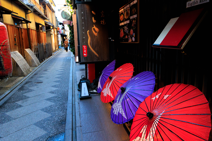
<img src="img-01.jpg" alt="京都">
<img src="img-02.jpg" alt="横浜">
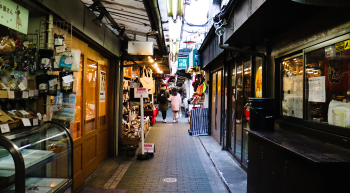
<img src="img-03.jpg" alt="吉祥寺">
<img src="img-04.jpg" alt="北海道">
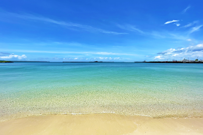
<img src="img-05.jpg" alt="沖縄">
</div>
<div class="slides-overlay">
<button id="close-02" aria-label="閉じる"></button>
<div class="slides-wrapper">
<button id="prev" class="active" aria-label="前へ"></button>
<img src="img-01.jpg" alt="京都">
<img src="img-02.jpg" alt="横浜">
<img src="img-03.jpg" alt="吉祥寺">
<img src="img-04.jpg" alt="北海道">
<img src="img-05.jpg" alt="沖縄">
<button id="next" class="active" aria-label="次へ"></button>
<p class="num-of-thumbnails"><span class="num"></span>/<span class="total-num"></span></p>
</div>
</div>
CSS
.thumbnails-wrapper{
   display: flex;
   flex-wrap: wrap;
   justify-content: center;
   gap: 20px;
   margin: 50px 0;
}
.thumbnails-wrapper img{
   max-width: 140px;
   object-fit: cover;
}
.thumbnails-wrapper img:hover{
   opacity: .7;
   cursor: pointer;
}
.slides-wrapper {
    padding: 0 20px;
    max-width: 1000px;
    position: relative;
}
.slides-overlay{
   display: flex;
   align-items: center;
   justify-content: center;
   position: fixed;
   left: 0;
   top: 0;
   margin: 0 calc(50% - 50vw);
   width: 100vw;
   height: 100vh;
   background-color: rgba(0, 0, 0, .8);
   visibility: hidden;
   opacity: 0;
   z-index: 1003;
   transition: .3s;
}
.slides-overlay.active{
   visibility: visible;
   opacity: 1;
   transition: .3s;
}
.slides-overlay img{
   display:none;
}
.slides-overlay img.active{
   display: block;
}
#close-02 {
   position: absolute;
   width: 50px;
   height: 50px;
   top: 10%;
   right: 5%;
   background-color: #000;
   transition: .3s;
   z-index: 1;
}
#close-02:hover {
   opacity: .7;
}
#close-02::before {
   content: "";
   position: absolute;
   top: 50%;
   left: 50%;
   width: 30px;
   height: 2px;
   background-color: #fff;
   transform: translate(-50%, -50%) rotate(45deg);
}
#close-02::after {
   content: "";
   position: absolute;
   top: 50%;
   left: 50%;
   width: 30px;
   height: 2px;
   background-color: #fff;
   transform: translate(-50%, -50%) rotate(-45deg);
}
#prev, #next {
    position: absolute;
   color: #959595;
    width: 50px;
    height: 50px;
    top: 50%;
    transform: translateY(-50%);
    background-color: rgba(62, 62, 62);
    transition: .3s;
}
#prev:hover, #next:hover {
   opacity: .7;
}
#prev.active, #next.active {
    background-color: #000;
}
#prev {
    left: -50px;
}
#next {
    right: -50px;
}
#prev.active::after, #next.active::after {
   position: absolute;
   top: 50%;
   left: 50%;
   transform: translate(-50%, -50%);
}
#next::after {
    content: '画像のURL';
}
#prev::after {
    content: '画像のURL';
}
.modal-opened {
    overflow-y: hidden; /*背景を固定*/
}
.num-of-thumbnails{
   color: #fff;
   text-align: center;
}
JavaScript
//サムネイルを取得
const thumbnails = document.querySelectorAll('.thumbnails-wrapper img');
//サムネイルの数を取得
const total_num = thumbnails.length;
//現在地を示す数字の枠
const num = document.querySelector('.num-of-thumbnails .num');
const total = document.querySelector('.num-of-thumbnails .total-num');
total.innerHTML = total_num;
//モーダル内の画像を取得
const slides = document.querySelectorAll('.slides-wrapper img');
//モーダル外枠取得
const modal_02 = document.querySelector('.slides-overlay');
//閉じるボタン取得
const closeBtn_02 = document.getElementById('close-02')
//前へボタン取得
const prevBtn = document.getElementById('prev');
//次へボタン取得
const nextBtn = document.getElementById('next');
//画像の順番を示す変数の定義
let currentIndex = '';
//画像クリック時の挙動
thumbnails.forEach(function(thumbnail, thumbnailIndex) {
thumbnail.addEventListener("click", function() {
document.querySelector('body').classList.add('modal-opened');
//モーダルを表示
modal_02.classList.add('active');
//クリックされた画像のindex
currentIndex = thumbnailIndex;
//クリックされた画像を表示
slides[thumbnailIndex].classList.add('active');
//クリックされた画像が何枚目か
num.innerHTML = currentIndex + 1;
//クリックされた画像以外を非表示
slides.forEach(function(slide, slideIndex){
if( (slide.classList.contains('active')) && (thumbnailIndex !== slideIndex) ){
slide.classList.remove('active');
}
});
//前後ボタンの活性/非活性
if( (currentIndex === 0) && (prevBtn.classList.contains('active')) ){
prevBtn.classList.remove('active');
}else if( (currentIndex !== 0) && (prevBtn.classList.contains('active') === false)){
prevBtn.classList.add('active');
}
if( (currentIndex === thumbnails.length - 1) && (nextBtn.classList.contains('active')) ){
nextBtn.classList.remove('active');
}else if( (currentIndex !== thumbnails.length - 1) && (nextBtn.classList.contains('active') === false) ){
nextBtn.classList.add('active');
}
});
});
//閉じるボタンクリック
closeBtn_02.addEventListener('click', ()=>{
//bodyをスクロール可能に戻すためクラス名を削除
document.querySelector('body').classList.remove('modal-opened');
//モーダルを非表示にするためクラス名を削除
modal_02.classList.remove('active');
}, false);
//前へボタンクリック時
prevBtn.addEventListener('click', ()=>{
//現在表示されている画像を非表示に
slides[currentIndex].classList.remove('active');
currentIndex--;
if (currentIndex < 0) { //一番最初の画像の場合
currentIndex = 0; //ループさせる場合はthumbnails.length - 1;
}
//前後ボタンの活性/非活性
if(currentIndex === 0){
if(prevBtn.classList.contains('active')){
prevBtn.classList.remove('active');
}
}
if(nextBtn.classList.contains('active') === false){
nextBtn.classList.add('active');
}
//ひとつ前の画像を表示
slides[currentIndex].classList.add('active');
//クリックされた画像が何枚目か
num.innerHTML = currentIndex + 1;
});
//次へボタンクリック時
nextBtn.addEventListener('click', ()=>{
//現在表示されている画像を非表示に
slides[currentIndex].classList.remove('active');
currentIndex++;
if (currentIndex >= thumbnails.length) {
currentIndex = thumbnails.length - 1; // ループさせたい場合は0
}
//前後ボタンの活性/非活性
if(currentIndex === thumbnails.length - 1){
if(nextBtn.classList.contains('active')){
nextBtn.classList.remove('active');
}
}
if(prevBtn.classList.contains('active') === false){
prevBtn.classList.add('active');
}
//次の画像を表示
slides[currentIndex].classList.add('active');
//クリックされた画像が何枚目か
num.innerHTML = currentIndex + 1;
});
デモ2「モーダルウィンドウでサムネイル表示」の解説
.slides-overlayがモーダルウィンドウとなる部分で、最初はvisibility: hiddenで非表示にしておきます。- サムネイルの一つをクリックしたときに、そのクリックした画像がどれかを把握するため、
document.querySelectorAllで取得したサムネイル画像をforEachで回しつつcurrentIndexにindexの値を入れています。 - 前後ボタンを押下したときには、
currentIndexの値を±1します。 - 画像をループさせるか、一番最初(あるいは一番最後)のサムネイルではそれ以上先に生かせないようにするか、どちらも仕様としてはあり得ると思いますが、ここでは後者にしています。
- 一番最初のサムネイルの時は前へボタンを非活性に、一番最後のサムネイルのときには次へボタンが非活性になるようにしています。その部分がコード量が多くなっていますが、ループさせる仕様にするとかなりコード量が減ります。
- HTMLの
<p class="num-of-thumbnails"><span class="num"></span>/<span class="total-num"></span></p>のところが画像のトータル枚数と、現在表示されている画像が何枚目かを示す数字の部分で、JavaScriptのinnerHTMLプロパティを使って数字を入れています。 - あとはデモ1と同じです。
モーダルウィンドウにおけるアクセシビリティとSEOに関する留意点
visibility: hiddenは画面上に表示しませんし、スクリーンリーダーも無視します。
モーダルウィンドウ内に説明すべき内容がある場合、アクセシビリティのことだけで言えば、クリックすると表示される内容がある、ということが伝わるようになっていれば問題というわけでもありません。開くボタンの近くに説明文を書くとか、開くボタン自体にラベルを付けるなどすればよいです。
しかし、SEOのことを考えると、ご紹介しておいてなんですが、デモ1のようにモーダルウィンドウ内に文章があるという状態は避けた方が良いと言えます。何故ならばCSSで非表示にしている場合、その中身はないページという前提で、Googleはそのページを評価する可能性があるからです。
よってモーダルウインドウは、デモ2のようのサムネイルをクリックしたら画像が大きく表示されるようにするといった使い方が一般的だと思います。
まとめ
モーダルウィンドウをjQueryなしで実装する方法とSEOを考えたうえでの留意点をご紹介しました。